Meridian Commerce Analytics
DRAMATIZED CASE STUDY
This is a reconstructed presentation of real product-design work. To protect confidentiality, the domain, data, terminology, visual details, and other identifying information have been abstracted or recreated. The design challenges, decisions, tradeoffs, and lessons reflect my actual work.
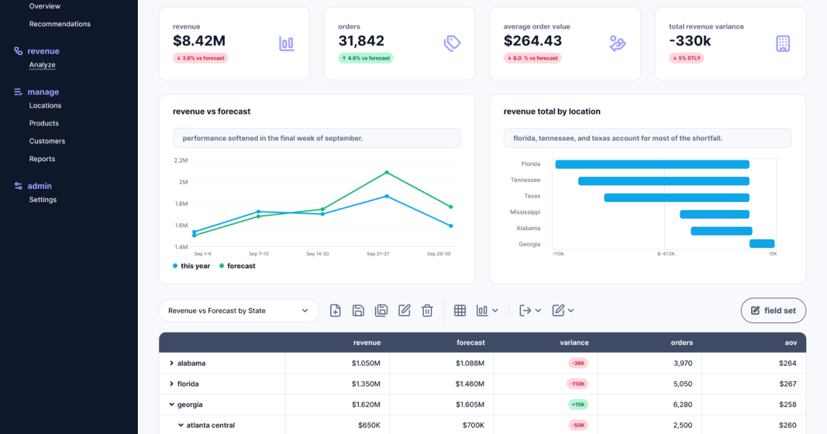
A B2B SaaS analytics platform that helps multi-location retail operators and regional managers understand sales performance across stores, regions, products, and customer segments. I worked on the core revenue analysis and operational dashboard interface to solve a problem that emerged when users struggled to pinpoint exactly why overall revenue fell behind forecasts despite healthy order volumes.
The challenge was not simply to display complex tabular data and trend lines. It was to contextualize anomalous performance—like a final-week drop in specific regional clusters—so users could instantly move from data observation to strategic action.
My Role
- Lead Product Designer managing UX architecture, interface design, and data visualization strategy.
- Executive-level dashboard wireframing, high-fidelity UI design, interaction states, and localized geographic performance charts.
- Worked in tight collaboration with one Product Manager and two Frontend Engineers.
- 4 weeks from exploratory data modeling to finalized UI specification.
The Challenge
- Hidden Regional Bottlenecks: Overall high-level metrics masked underperforming regional clusters, forcing users to dig through deep data hierarchies to find localized issues.
- Complex Hierarchical Structures: Users needed to seamlessly pivot view states from a high-level macro overview (e.g., state-wide performance) down into micro-level details (e.g., weekly performance variances within a single city sector like Atlanta Central).
- Action Over Observation: Regional managers needed clear visual signals to immediately distinguish between a volume problem (fewer orders) and a value problem (lower average order value) in order to plan store interventions.
- Data Denseness: The UI had to present macro trends, geographical bar charts, and deeply nested interactive tables on a single screen without causing cognitive overload or high interaction friction.
The product already had a robust back-end data engine capable of calculating real-time revenue vs. forecast variances across thousands of retail endpoints. The challenge was figuring out how to extend that strength to surface localized operational anomalies gracefully, allowing managers to instantly spot, isolate, and address underperforming regions.