Designs by Sabi*
“This would be fine if data were truly lossless — if data-based scoring systems could capture everything that was important in the world. But they don't. To understand why, we need to see why metrics are the way they are. We need to understand the design process by which we engineer metrics to do a specific job. And we need to go to the root-to grasp what data is and how it functions. We need to understand the inherent limitations of data. Because data isn't neutral. It is a specific format for understanding the world, one that exhaustively documents quantitative information and ignores qualitative information. It is a tool built for a very specific purpose. We need to understand the purpose and design of that tool, to understand when data-based approaches are appropriate-and when they are not. Data is engineered information, and metrics are engineered values.”
Meridian Commerce Analysis : More than Just a Dashboard
Sep 8, 2026
My first “serious” case study, Meridian Commerce Analysis, might elicit an eye roll. You see, us designers that have been doing this for a while know the tropes in our field. The endless amount of coffee (in a trendy mug of course!), the unsolicited redesign. The weather app with gorgeous gradients that make developers scratch their heads in consternation. And the ubiquitous dashboard interface. We all want to design a good dashboard, as it seems like one of those things that one must have™. We all preface the work with the declaration that “the problem with dashboards is that their data seldom tells us the actual STORY.” But I digress. This preamble is in a sense a way to say that I know that dashboards are not the most interesting way to display one’s skills as a designer.
But for me, an enterprise tool is a place we get the work done. It’s the place we find what work needs to be done. And there are few better ways to practice that than the humble dashboard surface. So without further ado, here is the story of the feature request that needed a rich way to display data, and the reasoning behind Meridian Commerce’s Revenue Analysis tool.
One thing I have learned through research and experience is that users that focus on numbers, for better or worse, enjoy using spreadsheet UIs to get the work done. It might not be a perfect solution, but the feature set is friendly for that cause. Meridian Commerce offers a slew of tools for users to view their data, but it lacked the familiar ability to slice dice, filter, and analyze using powerful customization engines. One might look at this problem and resort to BI, but BI can be heavy, almost too powerful for straightforward use cases. This was the conundrum that came to my design ticket. How can I entice our users to turn to our UI to analyze without overcomplicating it. In other words, how do we mitigate the payoff of the simplicity/rigidity and complicated/flexible binary?
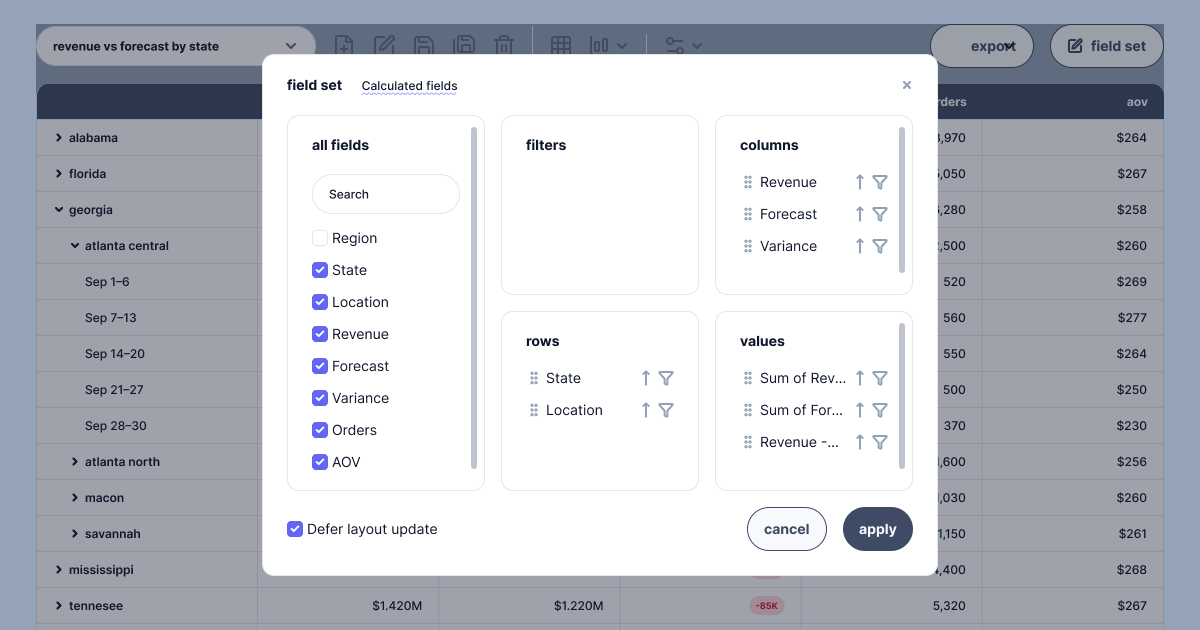
The answer, was… emulate the parts of Excel the users already love so they can dive in and slice and dice the data Meridian Commerce offers. Working with our dev and product teams, we were able to identify an easy win waiting for us in our current tech stack. Syncfusion offers a robust pivot table that allowed us to really take the Analysis UI and turn it into a masterpiece of progressive disclosure that expanded finally into a table that acts exactly like a spreadsheet pivot table. The solution we landed us provides high level metrics via stat cards to pinpoint the health of the business before scrolling to a set of charts to gather more detail regarding what is driving the metrics before ultimately offering the user a powerful Pivot table with all the bells and whistles. Nested categories, customization via the Field Set UI, and the ability to save reports makes for a UI that at a glance, looks like a dashboard, but in reality is a deeply personal experience that allows users to action on the high level metrics above. To sprinkle a bit more richness to the experience, we added lightweight verbiage for summaries generated by AI. This allowed us to integrate powerful summarizing and diagnostics subtly. We wanted to show, not tell what our AI did to enrich the dashboard. Ultimately the design for the Analysis page landed in a place of balance. A dashboard that is useful, not just a static place to see some numbers. And the spreadsheet appreciators among our clients? They loved the integraiton of that pivot table and were able to dive in with minimal training.