Designs by Sabi
“Joy is a form of resistance.”
Component Gravity: Star Chime’s UI in Figma
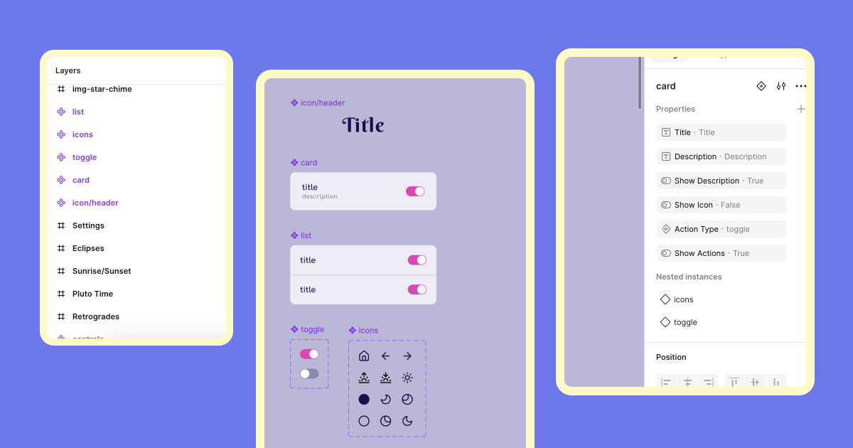
While Star Chime is a small and playful project, I treated its UI with the same design rigor I would apply to a more complex product. The structure is simple—an entry list, settings, and per-alarm configuration—but I wanted to build a modular, scalable interface from the start. That meant identifying reusable patterns and building a focused component library tailored to the app’s needs.
The mini component system included:
Header
- Title text
- Toggle star motifs
- Toggle description
- Description text
Toggle
- Active/inactive variants
Card
- Title text
- Leading icon
- Toggle description
- Description text
- Toggle action
- Action type (toggle or icon)
List
- Built from cards to create an advanced list pattern
Action Bar
- No properties
Icons
- Icon variants
These components were built to nest cleanly within each other, making it easy to update styles or functionality as the design evolved.
Like many designers, I begin with a bit of chaos, throwing ideas onto the canvas until patterns start to emerge. The biggest challenge was balancing the card action types. The toggle component is wide, while the icon is square, which threw off alignment and sizing. I resolved this by fixing the height of the toggle action while using auto layout to scale icons proportionally within their frame. It took some fiddling, but the solution now supports both flexibility and consistency. Something I’ll carry forward to future system work.
Once the IA and component library were in place, screen layout was fast, consistent, and scalable. Even a “small” project like Star Chime benefitted from systems thinking—and that’s the real value I try to bring to every design I touch.
Curious about my project inspiration? Check out the writeup here.
Or view the full case study: Star Chime Project.